branding
design
colors
fonts
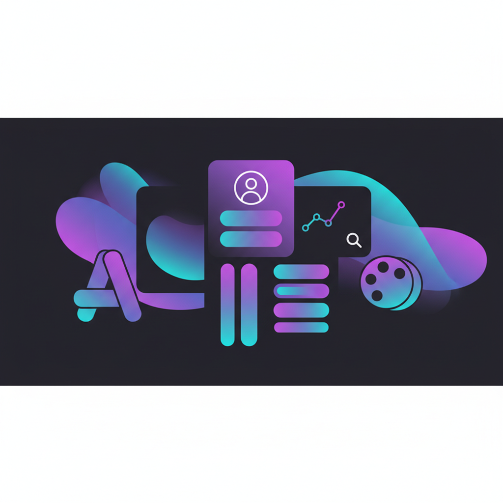
Branding Your Link in Bio: Colors, Fonts, and Visual Guidelines
Keep your link in bio on-brand with consistent colors, typography, and visual identity. Guidelines for cohesive presentation.
liiiinks Team
2 min read
Your link in bio should feel like an extension of your brand. Here's how to maintain consistency.
Color Consistency
Use Your Brand Colors
Pull colors from your logo, website, or social media presence.Create a Simple Palette
- Primary color (buttons, accents)
- Background color
- Text color
Ensure Readability
High contrast between text and backgrounds. Test on multiple devices.Typography Guidelines
Match Your Brand Voice
- Formal brands: Classic, serif-style fonts
- Modern brands: Clean sans-serifs
- Creative brands: Distinctive but readable
Limit Font Choices
One or two fonts maximum. Consistency builds recognition.Visual Identity Elements
Profile Photo
Match the style across platforms. Same photo or same visual approach.Icons and Images
If using icons, choose a consistent style (outlined, filled, colored).Overall Mood
Luxurious? Playful? Minimal? Your page should match.Quick Branding Checklist
- [ ] Colors match existing brand
- [ ] Typography is consistent
- [ ] Profile photo is current and on-brand
- [ ] Overall feeling matches your identity
Build a Branded Experience
Create your liiiinks page with themes and customization that match your brand perfectly.
👉 Get started | Features | Pricing
Related Articles
How to Build a Link in Bio That Feels Like a Mini Website
Transform your link in bio from a simple list into a structured mini-website with sections, hierarchy, and rich content.
design
structure
From Awkward First Date to Long-Term Relationship: Glow-Up Your Link in Bio
Dating metaphors meet link-in-bio strategy. It's more relatable than you'd think.
playful
design
Best Practices for Designing a Clean and Minimal Link in Bio Page
Learn design principles for creating a professional link in bio page. Tips on layout, typography, color, and hierarchy for non-designers.
design
minimalism